10:38
A Beginner's Guide to Graphing Data
Bozeman Science
Overview
This video explains the fundamental importance of graphing data for understanding patterns and trends, especially in science. It introduces five common graph types: line, scatter, bar, histogram, and pie charts, detailing when to use each based on the data and the question being asked. The video also emphasizes the crucial elements of a well-constructed graph, including descriptive titles, labeled axes with units, appropriate scaling, and accurate data representation, while highlighting common errors to avoid.
How was this?
Save this permanently with flashcards, quizzes, and AI chat
Chapters
- Raw data, presented as lists of numbers, is often incomprehensible and makes it difficult to identify patterns.
- Graphs and charts are visual tools that transform complex data into understandable formats.
- Famous examples, like the Keeling Curve showing CO2 levels, demonstrate how graphs reveal critical trends (e.g., global warming) that would be hidden in raw numbers.
- Choosing the correct graph type is essential for accurately representing data and communicating findings.
Understanding why graphs are essential helps learners appreciate their value beyond simple visualization, motivating them to learn how to create effective ones.
The Keeling Curve, illustrating rising atmospheric CO2 levels over time, which is incomprehensible as raw numbers but clear as a graph.
- Line graphs are used to show changes over time, with time typically on the x-axis.
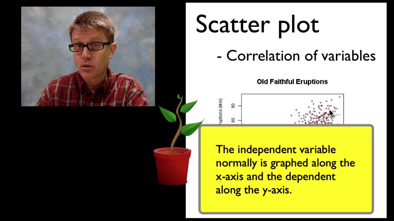
- Scatter plots are used to show the correlation between two numerical variables, helping to identify relationships (independent variable on x-axis, dependent on y-axis).
- Bar graphs compare distinct groups or categories, with each bar representing a specific group's data (often an average).
- Histograms display the distribution of a single numerical variable by grouping data into bins (bars touch).
- Pie charts illustrate parts of a whole, showing proportions or percentages of a total.
Knowing the specific use case for each graph type ensures that data is presented in a way that accurately answers the intended question.
Using a line graph to track a plant's growth over time, a scatter plot to see if fertilizer amount correlates with plant height, a bar graph to compare photosynthesis rates under different light colors, a histogram to show the distribution of tree heights, and a pie chart to represent the percentage of different rodent families.
- A descriptive title is crucial; it should tell the complete story of the data presented, including what is being measured and where/when.
- Axes must be clearly labeled with the variable being measured and its units (e.g., 'Temperature (°C)').
- Graphs should have linear scaling with consistent intervals between major grid lines.
- Data points should be plotted accurately.
- For scatter plots showing correlation, a 'best fit' line can be added to represent the trend, with roughly half the points above and half below it, and it should not extend beyond the data range.
Following these structural guidelines ensures that a graph is clear, accurate, and easily interpretable by anyone viewing it.
A scatter plot for ice cream sales vs. average high temperature, with the title 'Correlation of Ice Cream Sales and Average High Temperature in Bozeman,' the x-axis labeled 'Average High Temperature (°F)' and the y-axis labeled 'Ice Cream Sales (cones)'.
- Vague or overly simplistic titles fail to convey the graph's content.
- Incorrect variable placement on axes (e.g., dependent variable on x-axis instead of independent).
- Forgetting to include units in axis labels.
- Connecting data points on a scatter plot, which implies a continuous relationship that may not exist.
- Using non-linear or inconsistent scaling on axes, making comparisons misleading.
- Extending the best fit line beyond the range of the plotted data.
- Including zero on an axis when the data does not start near zero, which can distort the visual representation of changes.
Recognizing and avoiding common errors prevents the creation of misleading or inaccurate graphs, ensuring that scientific communication is clear and honest.
A 'bad' scatter plot where the title is just 'Plant Growth,' the independent variable (fertilizer) is on the y-axis, data points are connected, scaling is inconsistent (5, 7, 11, 15), and the best fit line extends past the data points.
Key takeaways
- Graphs are essential tools for making complex data understandable and revealing hidden patterns.
- The choice of graph type (line, scatter, bar, histogram, pie) depends entirely on the type of data and the question being investigated.
- A well-constructed graph requires a descriptive title, clearly labeled axes with units, and appropriate, linear scaling.
- Scatter plots are ideal for showing relationships between two variables, with the independent variable on the x-axis.
- Bar graphs are for comparing discrete categories, while histograms show the distribution of a single numerical variable.
- Avoid common errors like vague titles, incorrect axis placement, connecting scatter plot points, and inconsistent scaling to ensure data accuracy.
- Understanding the purpose of each graph type is as important as knowing how to draw it.
Key terms
GraphChartPlotLine GraphScatter PlotBar GraphHistogramPie ChartIndependent VariableDependent VariableCorrelationBest Fit LineAxisUnitsScaling
Test your understanding
- Why is visualizing data with graphs more effective than looking at raw numbers?
- Under what circumstances would you choose a line graph over a scatter plot?
- How can you differentiate between a bar graph and a histogram?
- What are the essential components of a well-labeled graph, and why is each important?
- What are the potential consequences of using non-linear scaling on a graph's interpretation?