How to Build a Power Apps Gallery with Horizontal & Vertical Scroll | Editable Table
Reza Dorrani
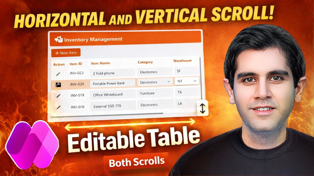
Overview
This video demonstrates how to build a responsive Power App with a gallery that supports both horizontal and vertical scrolling, creating an editable table-like interface. It covers setting up a responsive app structure, connecting to a data source, and configuring a gallery to display numerous rows and columns. Key techniques include using horizontal containers within the gallery for column layout, managing control widths with flexible width and minimum width properties, and implementing the crucial minimum width property on the gallery itself to enable horizontal scrolling. The tutorial also explains how to achieve vertical scrolling by adjusting the gallery's minimum height and the container's overflow properties. Finally, it details how to add functional headers that align with the gallery content and implement editable fields with save/cancel functionality, including adding new items and deleting existing ones, thus creating a fully functional CRUD (Create, Read, Update, Delete) experience.
Save this permanently with flashcards, quizzes, and AI chat
Chapters
- Start with a blank responsive canvas app and utilize responsive container layouts for header and main content areas.
- Insert a modern header control for the app title and logo.
- Connect the app to a data source, such as a Dataverse table named 'inventory', to populate the gallery.
- Ensure modern controls and themes are enabled in app settings for advanced UI elements.
- Insert a vertical gallery control and set its layout to 'Blank' to design a custom table-like experience.
- Configure the gallery's alignment and flexible height within its parent container, and remove container padding for a seamless fit.
- Set the gallery's template size (row height) and remove template padding for precise control over row appearance.
- Insert a horizontal container within the gallery's template to manage the layout of columns for each row.
- Add various modern controls (text, combo box, number input) within the horizontal container to represent different data fields.
- Set control properties like 'Text' or 'Value' to display data from the current gallery item (e.g., 'ThisItem.ItemID').
- Use choice columns (like 'Category') with combo box controls, setting their items to 'Choices(YourDataSource.YourChoiceColumn)' and default selected items to 'ThisItem.YourChoiceColumn'.
- Implement read-only formula columns (like 'Total Value') using text controls that calculate values based on other fields.
- Manage column widths within the gallery's horizontal container using 'Flexible Width' and 'Minimum Width' properties.
- Set a 'Minimum Width' for controls like 'Item Name' to prevent them from becoming unreadably small on different screen sizes.
- Set fixed widths for certain columns (e.g., 'Item ID') where a consistent size is desired.
- Crucially, set the gallery's 'Layout Minimum Width' property to the X position plus the width of the last control in the horizontal container to initiate horizontal scrolling.
- Change the parent container's 'Horizontal Overflow' property from 'Hide' to 'Scroll' to make the horizontal scrollbar visible.
- Hide the gallery's default scrollbar by setting 'Show scroll bar' to 'Off'.
- Calculate the gallery's 'Layout Minimum Height' based on the total number of items and the template height (e.g., 'Gallery.AllItemCount * 40').
- Set the container holding the gallery to have 'Vertical Overflow' set to 'Scroll' to enable vertical scrolling.
- Create a separate horizontal container above the gallery to act as a header row.
- Align header controls (text labels) with their corresponding gallery controls by matching properties like 'Fill Portions', 'Width', and 'Layout Minimum Width'.
- Add an 'Edit' button within the gallery's horizontal container to trigger edit mode for a specific row.
- Use a variable (e.g., 'varSelectedItem') to store the currently selected item for editing.
- Dynamically set the 'Display Mode' property of editable controls to 'Edit' if the current item matches 'varSelectedItem', otherwise 'View' (or 'Disabled').
- Change the 'Edit' button's icon and text dynamically to 'Save' when a row is selected for editing.
- Implement the 'Save' logic using the 'Patch' function to update the data source with changes made to editable controls.
- Add a 'New Item' button outside the gallery to initiate the creation of a new record.
- Use the 'Patch' function with 'Defaults(YourDataSource)' to create a new blank record in the data source.
- Update the 'varSelectedItem' variable to the newly created record to immediately place it in edit mode.
- Implement a 'Delete' function (though not explicitly detailed in the provided transcript snippet, it's mentioned as a CRUD operation) to remove records from the data source.
- Optionally, sort the gallery items by creation date to display new items at the top.
Key takeaways
- A responsive gallery with both horizontal and vertical scrolling can be achieved by carefully configuring container properties and gallery layout settings.
- The 'Minimum Width' property on gallery controls and the gallery's 'Layout Minimum Width' are critical for enabling horizontal scrolling.
- Vertical scrolling is enabled by controlling the gallery's 'Layout Minimum Height' and the parent container's 'Vertical Overflow'.
- Headers can be synchronized with gallery content by mirroring control properties like width and minimum width.
- Editable fields within a gallery are managed by dynamically controlling the 'Display Mode' property based on a selected item variable.
- The 'Patch' function is essential for saving changes and creating new records in the data source.
- Implementing full CRUD operations (Create, Read, Update, Delete) transforms a gallery into a powerful data management interface.
Key terms
Test your understanding
- How can you enable both horizontal and vertical scrolling simultaneously in a Power Apps gallery?
- What is the purpose of the 'Minimum Width' property for controls within a gallery's horizontal container, and how does it relate to the gallery's 'Layout Minimum Width'?
- Explain the steps required to create synchronized headers that scroll alongside the gallery content.
- How do you make specific fields within a gallery editable, and what Power Fx functions are used to control this behavior?
- Describe the process of adding a new record to a data source directly from a Power Apps gallery using the 'Patch' function.