9:23
Every UI/UX Concept Explained in Under 10 Minutes
Kole Jain
Overview
This video explains fundamental UI/UX design concepts, focusing on how to create intuitive and visually appealing interfaces. It covers principles like signifiers, visual hierarchy, typography, color theory, dark mode considerations, shadows, icons, buttons, input states, and micro-interactions. The goal is to equip learners with the knowledge to design user interfaces that are not only functional but also aesthetically pleasing and easy to understand, emphasizing practical application and learning from real-world examples.
How was this?
Save this permanently with flashcards, quizzes, and AI chat
Chapters
- Signifiers communicate how a UI element should be used (e.g., button states, highlights, tooltips).
- Visual hierarchy guides the user's eye by using size, position, and color to emphasize important information.
- Larger, bolder, and more colorful elements, especially images, tend to be perceived as more important and should be placed higher.
- Contrast between elements (e.g., small vs. large, colorful vs. muted) is key to establishing hierarchy.
Understanding signifiers and visual hierarchy ensures users can intuitively understand and interact with an interface without explicit instructions, leading to a more efficient and less frustrating user experience.
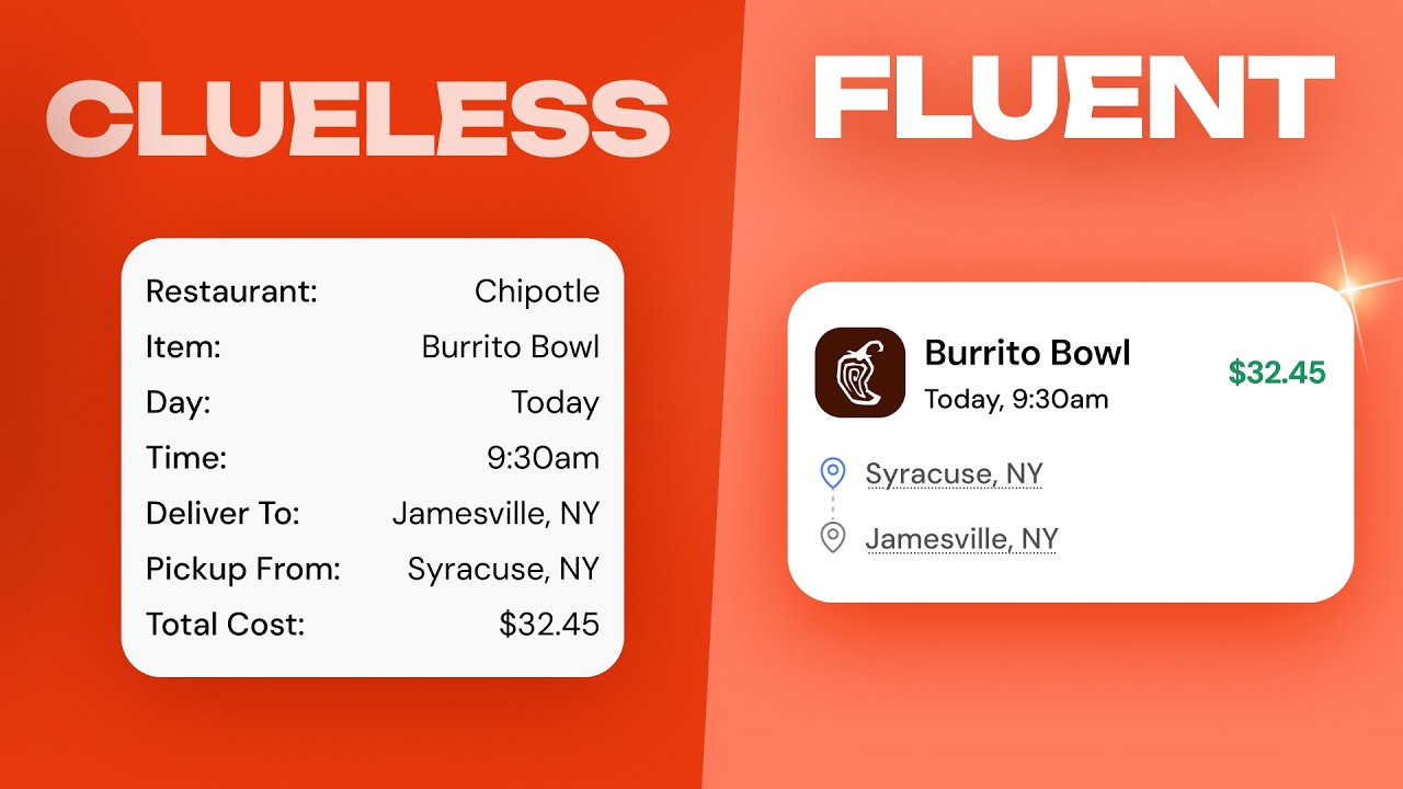
Using a large, bold font at the top for an item's name and a smaller font below for the time and date to establish what is most important.
- Grids (like 12-column) are guidelines, not strict rules, and can be adapted for different layouts and responsiveness across devices.
- White space (or negative space) is crucial for readability and separating elements, allowing the design to 'breathe'.
- Consistent spacing, often based on a four-point grid system (multiples of 4 or 8 pixels), creates visual rhythm and consistency.
- Grouping related elements together visually is another way to establish hierarchy and organization.
Effective use of layout, grids, and white space prevents visual clutter, improves scannability, and ensures a consistent and organized appearance, which is vital for user comprehension and aesthetic appeal.
Maintaining 32 pixels of space between distinct sections of content, while grouping related text and subtext closer together.
- Limit font choices to one or two well-chosen fonts (often a sans-serif) to maintain consistency.
- Adjusting letter spacing (kerning) and line height can significantly improve the perceived professionalism of large text.
- Typography hierarchy involves using different font sizes to distinguish between headings, body text, and other elements, with fewer sizes used in high-density interfaces.
- Seeking inspiration from real-world designs on platforms like Mobbin is essential for learning and applying effective typographic solutions.
Typography is a core element of design; mastering its use, from font selection to spacing and hierarchy, dramatically impacts readability and the overall aesthetic quality of an interface.
Tightening letter spacing on a header by -2% to -3% and setting line height to 110%-120% to make it appear more polished.
- Start with a primary brand color and use lighter/darker variations for backgrounds and text to create a cohesive palette.
- Utilize semantic colors (e.g., red for danger, green for success) to convey meaning and provide user feedback.
- In dark mode, reduce contrast, use lighter elements for depth instead of shadows, and adjust saturation/brightness to avoid harshness.
- Color should be used purposefully to guide attention and communicate information, not just for decoration.
Strategic use of color enhances usability by providing cues, establishing branding, and improving visual appeal, while careful consideration of dark mode ensures readability and comfort in different lighting conditions.
Using a green color for a 'success' message or a red border for an input field indicating an error.
- Shadows in light mode create depth; adjust opacity and blur to make them subtle and effective, not overpowering.
- Icons should generally match the line height of the surrounding text for visual harmony.
- Buttons, especially 'ghost buttons' (text with hover effects), need clear states (default, hover, active, disabled) to indicate interactivity.
- A common guideline for button padding is to make the width double the height, creating a balanced clickable area.
Mastering the use of shadows, icons, and buttons contributes to a polished and interactive user experience, ensuring users understand clickable elements and their states.
Creating a button with padding such that its width is twice its height, providing ample clickable space.
- Every user action should have a visible response, including input fields (focus, error states) and loading processes.
- Micro-interactions provide subtle feedback on actions, confirming completion or indicating progress.
- Overlays, like gradients or blurs, can be used to blend images with text-readable backgrounds effectively.
- Consistent feedback mechanisms build user confidence and improve the perceived responsiveness of the interface.
Providing clear feedback and engaging micro-interactions makes an interface feel alive and responsive, guiding users through processes and confirming their actions, which is crucial for a positive user experience.
A 'copy to clipboard' button triggering a small chip to slide up, confirming that the text has been copied.
Key takeaways
- Design interfaces that clearly communicate their functionality through intuitive signifiers.
- Establish a strong visual hierarchy using size, color, and placement to guide user attention.
- Leverage white space and consistent spacing to create clean, organized, and readable layouts.
- Typography and color are powerful tools that, when used intentionally, significantly enhance both aesthetics and usability.
- Ensure all interactive elements provide clear visual feedback for user actions and states.
- Seek inspiration from existing successful designs to inform your own design decisions.
- Consider the context of use, such as dark mode, to ensure optimal readability and comfort.
Key terms
SignifiersVisual HierarchyWhite SpaceTypographyKerningLine HeightSemantic ColorsDark ModeGhost ButtonsMicro-interactions
Test your understanding
- How do signifiers help users understand how to interact with a UI element?
- What are the primary tools used to establish visual hierarchy in a design?
- Why is white space considered important in UI design?
- What are the key considerations when designing typography for different types of interfaces?
- How can color be used effectively beyond mere decoration in UI design?
- What are the essential states a button should typically have to provide good user feedback?
- What is the purpose of micro-interactions in a user interface?