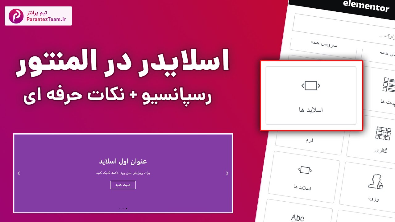
معرفی و آموزش اسلایدر المنتور + اسلایدر رسپانسیو + بدون افزونه جانبی + نکات حرفه ای
Amir Yami
Overview
This video provides a comprehensive guide to using the Elementor slider widget, focusing on creating responsive designs without relying on additional plugins. It covers detailed customization options for individual slides, including background settings, content arrangement, styling, and navigation controls. The tutorial also addresses the challenges of making sliders responsive across different devices and offers practical strategies for achieving this, such as using device-specific sliders or adjusting height settings for optimal viewing on tablets and mobile phones. The presenter emphasizes best practices for integrating sliders into website design for a professional and user-friendly experience.
Save this permanently with flashcards, quizzes, and AI chat
Chapters
- Elementor's built-in slider widget allows for creating image or content sliders.
- Default sliders may not display correctly on mobile devices, requiring responsive adjustments.
- The slider widget can be added by searching for 'slider' or 'slides' in the Elementor widget panel.
- Each slider is composed of individual slides, each with its own customizable settings.
- Each slide allows for background customization, including solid colors or background images.
- Background images can be set to 'cover' to fill the slide, 'contain' to fit within dimensions, or 'auto'.
- An 'effect' can be applied to the background image, such as zooming in or out.
- A background overlay can be added to improve text readability over images.
- Content within a slide (title, text, button) can be styled, positioned, and linked.
- The overall height of the slider can be adjusted globally.
- Navigation options include arrows, dots, or drag-and-drop functionality, which can be enabled or disabled individually or together.
- Autoplay can be enabled, with a customizable delay and an option to pause on hover.
- Transition speed and animation type (e.g., fade, zoom, slide from direction) can be set for slide changes.
- The width of the content area within slides can be adjusted.
- Spacing between titles, text, and buttons can be fine-tuned.
- Typography, colors, and text shadows for titles and descriptions can be customized.
- Button styles, including background color, border, and hover effects, can be modified.
- Navigation elements (arrows and dots) can be resized, repositioned, and recolored.
- Sliders often require specific adjustments for tablet and mobile views, as default settings may not adapt well.
- One method is to create duplicate sliders and use Elementor's responsive visibility settings to show specific sliders on specific devices (e.g., one for desktop, one for mobile).
- Alternatively, the height of the slider can be adjusted for different devices within the Elementor editor.
- Care must be taken to ensure that content remains legible and visible on smaller screens when adjusting height.
- Design images for sliders with mobile-first considerations or create device-specific assets.
Key takeaways
- Elementor's slider widget offers extensive customization for backgrounds, content, and navigation.
- Responsive design for sliders is essential and requires deliberate adjustments for different screen sizes.
- Consider creating device-specific sliders or carefully adjusting height and content placement for optimal mobile and tablet viewing.
- Background overlays and text shadows can significantly improve content readability on image-heavy slides.
- While Elementor provides many styling options, sometimes pre-designing slider images in tools like Photoshop offers more control.
- Autoplay and transition settings should be balanced to provide a smooth user experience without being distracting.
- Always test your sliders across multiple devices to catch any display or functionality issues.
Key terms
Test your understanding
- How can you ensure that text placed over a background image in an Elementor slider is easily readable on all devices?
- What are the two primary methods discussed for making an Elementor slider responsive across different screen sizes?
- Why is it important to adjust the height of a slider differently for desktop, tablet, and mobile views?
- Describe how to customize the appearance of the navigation arrows and dots for an Elementor slider.
- What is the purpose of the 'background overlay' option within the Elementor slider's slide settings?